THE COMPANY
PROJECT
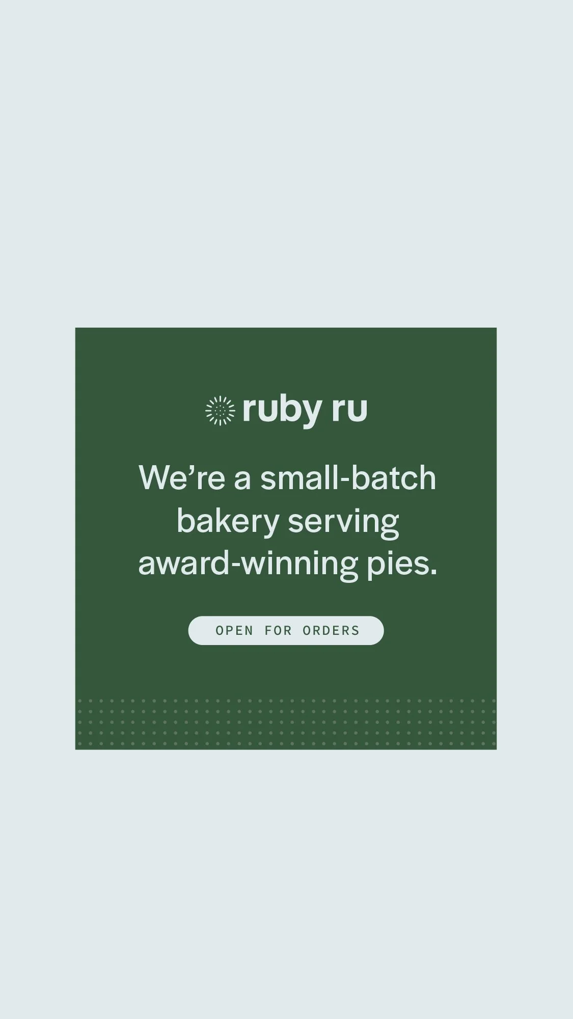
Ruby Ru bakes classic desserts with a lot of love in south Oregon. Their namesake was a sweet family friend, Ruby, who passed down her prized pie crust recipe to the client.
Brand Identity
Collateral
THE BRIEF
Ruby Ru's award-winning desserts are inspired by nostalgic flavors, so we wanted a nod to vintage in the brand design, but still wholeheartedly modern and clean.
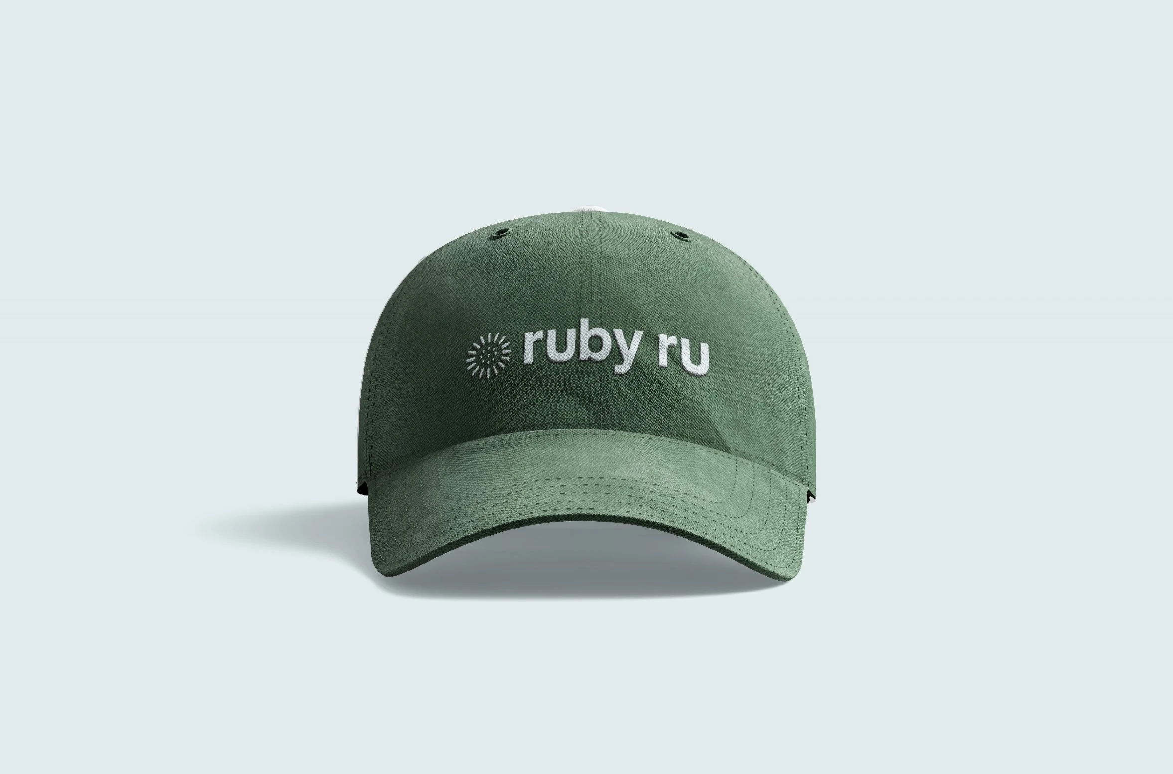
Ruby Ru’s recipes are classic and traditional, and their signature pie crust was handed down from a dear friend named Ruby. So Angie wanted Ruby Ru’s branding to feel modern and fresh, but honor the classic roots of her business with a nod to vintage design. We bridged that gap with colors that feel both classic and current, clean and simple typography and a brand icon that alludes to the perforated patterns of vintage pie safes.
After the redesign, Angie had the confidence and momentum to start taking on more farmers markets and events, working toward her goals of catering and shipping her desserts, and has won multiple dessert competitions throughout her region. Flavor and style… yes, please.


